I have decided that my magazine will be printed by Blurb, an online self-publishing and marketing platform that lets you publish professional-quality printed books and ebooks.
![]()
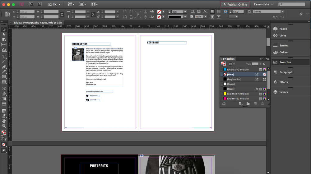
I will be designing the magazine from scratch in Adobe InDesign, and I have already created the document. Here’s how I did it:
1. Downloaded and installed the Adobe Indesign plug-in from Blurb
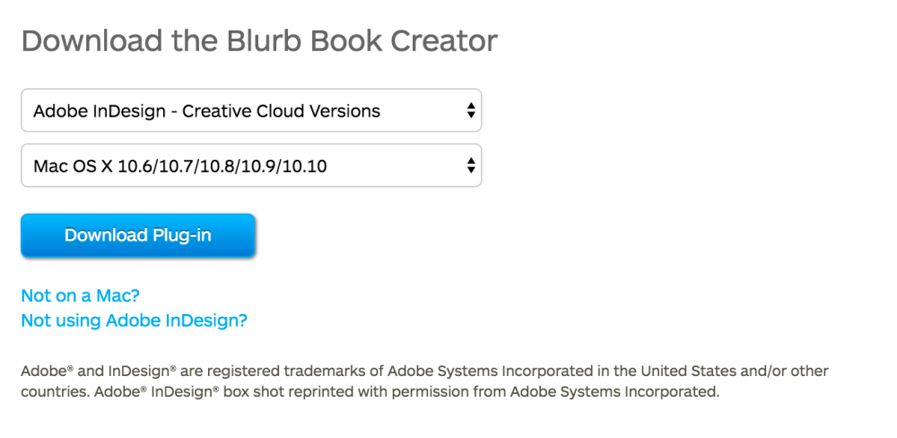
2. Created the document using the Blurb Book Creator plug-in
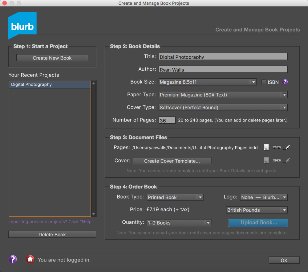
3. Started laying out the first pages with an introduction to magazine etc.
This process was relatively easy as Blurb provide detailed instructions on how to achieve this.
However, certain settings elsewhere need to be configured and adjusted to achieve good results at the printing stage. Some major steps should be followed on every image that will be included in the magazine. I am going ‘ready’ each of my images for print using Adobe Photoshop.
Backlit monitors display images using coloured light known as RGB, but printers use the CMYK colour space. This means that when you’re looking at a photograph you took on a monitor before sending it off to print, you are not seeing an accurate representation of what it is going to come out looking like. RGB monitors can display many more colours and have a larger colour gamut than printers.
I am managing the colour on every photograph I use to ensure that I will get the best results possible when getting the magazine printed. It is very time consuming, but also very important.
Here is what I have been doing:
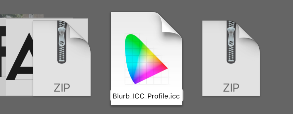
Installing the Blurb ICC Profile
The first thing I did was install the Blurb ICC Profile, which is used for high-end commercial printing. This is very important for colour management as it allows you to proof your images while in RGB or convert your images to the CMYK colour space of the print device.
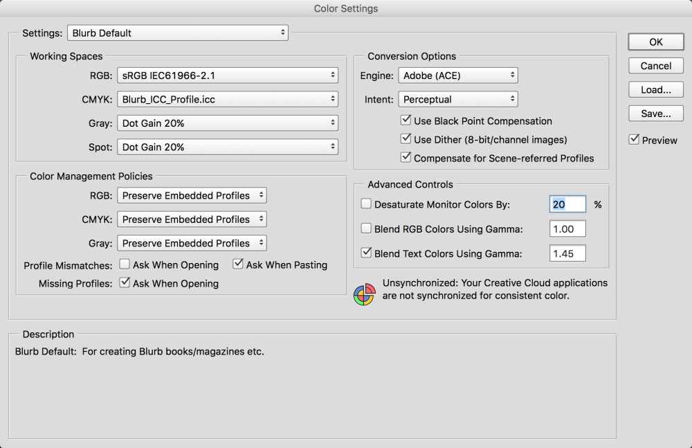
Set correct colour settings
With the Blurb ICC Profile installed, I am able to use it in Adobe Photoshop to ensure I get the best results. I went to Edit > Colour Settings and set the relevant working spaces, etc…
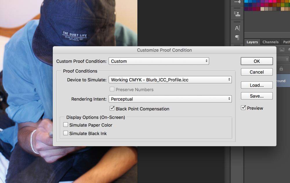
Proofed each photograph
I set the proof conditions on Photoshop to simulate the Blurb printers. This allows me to preview how the photograph will look in print as accurately as possible.
Checked the gamut
With the proof conditions set to show me how the photographs will look in the magazine, I am able to check for out-of-gamut colours on each one. Gamut basically refers to the range of colours and tones that a device can capture, display or print.
With the gamut warning turned on I can see which areas of each photograph might be affected during print, like so…
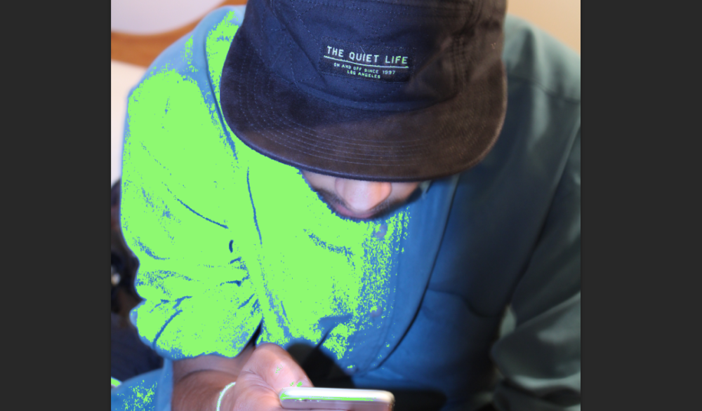
If areas of photographs are highlighted in green like this, it means that those colours or tones are not printable according to the set ICC Profile. My aim is to completely remove the green by making adjustments to the specific areas of the photographs that have been highlighted.
First, I add a Vibrance adjustment layer…
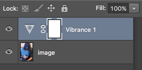
Then, I set the colour range of the adjustment layer to Out of Gamut
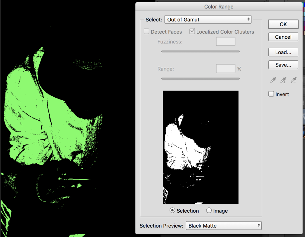
This means the adjustments will only be made to the unprintable areas.
After this, I alter the vibrance and saturation accordingly until the highlighted area completely disappears.
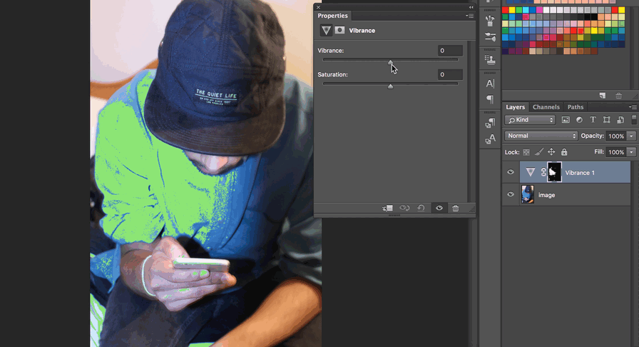
Once the gamut warning no longer shows any highlights, and once I am happy with the soft proof, the image is ready to go in the magazine!
I save them in a JPEG format before placing them into my InDesign document.
I learned a lot of these processes after following these tutorials:
